

This website uses cookies so that we can provide you with the best user experience possible. Cookie information is stored in your browser and performs functions such as recognising you when you return to our website and helping our team to understand which sections of the website you find most interesting and useful.
Web Marketing by Color—What Color Will Increase Your Sales?
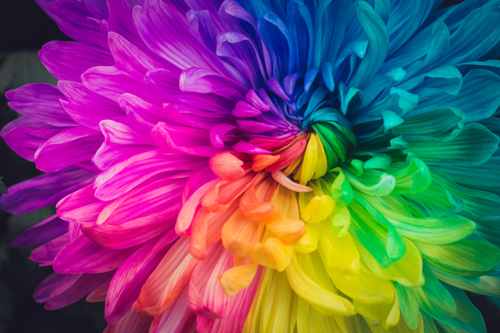
Do a quick Google search of “color marketing” (or similar terms), and you’ll be flooded with results—scholarly and not-so-scholarly—about the psychology of color choice in branding and marketing campaigns. Many pieces make it sound simple—you pick one color to create specific emotional response from your audience. But if were that simple, we would already know what color encourages people to buy…and every brand’s logo would use it.
But with the plethora of logos and color schemes out there, obviously, color in marketing isn’t so cut-and-dried. Yet, it is an important consideration for your website to do what it’s designed to do—increase conversions. The key to boosting performance of your website is to select a color scheme consistent with your offerings and to use color to boost visibility of calls to action.
Color Consistency
The research behind infographics that pair a handful of adjectives to one hue on the ROYGBIV spectrum (e.g. Red is POWERFUL, Yellow is CONFIDENT) is sketchy at best. What research more solidly confirms is that what matters to consumers is not so much the actual color but the color’s appropriateness to the brand/product. Rather than try to guess what particular shade or tint prospective consumers will like, you should select branding colors that are consistent with the personality or attitude you want consumers to associate with your brand/product.
Here’s an example: Harley-Davidson’s logo inspires the feeling of boldness, confidence and adventurousness. But Harley-Davidson’s logo isn’t effective because they chose orange, per se; it’s because they used a bold color—a color consistent with the pathos they hope to inspire in their buyers.
Colored for Action
Colors for a logo and/or branding color scheme will influence the look of your website, but it shouldn’t dictate it. On the page, color should be used to draw your viewers’ eyes quickly to what really matters—your calls to action. Research shows that bold and/or contrasting colors are one of the most effective ways to do this. And with a skilled graphic designer behind the dashboard, it can be done without turning your website into an eyesore. Two pointers for selecting color “pops”:
- Accent colors should be used sparingly—no more than 10% of the entire visual layout.
- A contrasting color to one of your primary branding shades typically makes an effective accent color.
Conversions can increase simply by making it clearer to the viewer where to click.
Show Your Colors
SonicSEO.com applies color psychology to help make your website an effective marketing tool. We never dictate what colors you should use, but we employ your chosen branding colors (and their complements) to highlight the elements that direct users where you want them to go.
If you are considering redesigning your logo or rebranding, contact us for a website redesign to be consistent with the updated personality and color scheme.