

What’s the Difference Between Responsive and Adaptive Websites?
Your business’s website serves as its virtual storefront online. As a result, it must present the best possible view of your business, while also being easy to navigate and pleasing to look at.
In this case, you have two website design options: responsive and adaptive. Both design options offer great benefits, but one might be better suited to your specific needs. Here are some key differences between responsive and adaptive sites to help you make the right choice.
Responsive Web Design
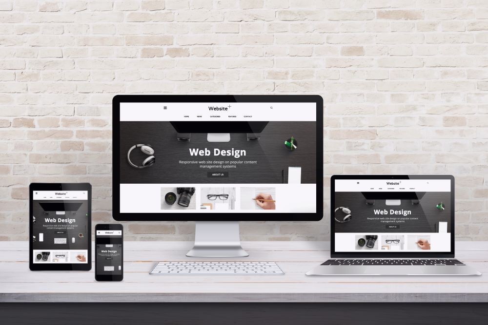
Responsive design refers to sites with layouts that adapt to whatever device they’re being viewed on. The site remains the same from device to device, but the appearance of the site will vary to ensure viewers are privy to a pleasing layout and easy navigation.
Responsive design is beneficial when you consider how many people view websites on smartphones, as opposed to laptops or desktop computers. If sites appeared uniform across all devices, mobile users would have a frustrating experience when trying to navigate a site. This can be a major detriment to businesses, who would likely lose potential customers to poor website experiences on mobile devices.
Adaptive Web Design
Unlike responsive design, adaptive web design creates different layouts for each type of device. For instance, each device (including smartphones, notepads, laptops, or desktop computers) would have its own unique layout that would populate whenever a person is viewing a website.
Adaptive design allows web designers to create a distinct user experience from device to device. User experience, which refers to a person’s satisfaction (or lack thereof) when using a site is a major ranking factor when it comes to search results. When user experience is lacking, there’s a risk that the person may click away.
How to Choose the Right Web Design Strategy
Adaptive design does have a positive impact on user experience, which can help businesses improve their online visibility by appearing higher in search results. However, creating numerous layouts for the same website is time-consuming, as well as taking a bigger bite out of a business’s marketing budget. There may also be SEO consequences, as search engines like google prefer responsive designs to adaptive ones.
Responsive design can also create a favorable user experience, albeit without the same detail as adaptive design. And because the development of responsive design is more efficient and cost effective, it can be a good option for businesses with smaller marketing budgets who don’t want to sacrifice quality. You’ll also have fewer concerns about a decreased search rank due to Google’s preferences.
Your Trusted Partner in Web Design
Your business’s website is your digital storefront online, so it must offer the best possible experience to users. That’s precisely why so many business owners trust in the services we provide at SonicSEO.com, as we understand the importance of a visually appealing, user-friendly site that best represents your brand. Feel free to contact us to learn more about our web design services.